MIR MEDIA
MIR MEDIA is a digital agency in Cologne that makes websites for cultural institutions: orchestras, concert halls, opera houses, theatres and festivals.
Role: Designer
Year: 2018–2021
mir.de, the agency’s own website, which I designed.
My role
I worked on projects from start to finish: workshops with clients, wireframes, UX and UI design, prototypes, user tests and the handover to developers. Our clients had large editorial teams who update their websites themselves, so my designs had to work with any content on any screen.
I led some of the agency’s best-known projects: the Elbphilharmonie, the Vienna Philharmonic and the agency’s own website, together with the rebranding of MIR MEDIA itself. I also worked with Oper Leipzig, Ruhrtriennale, the Gürzenich Orchestra, GRIPS theater, the Berliner Philharmoniker and many more.
Productising agency work
MIR MEDIA made websites for cultural institutions, with ticket sales built in. Every website had its own identity, but they shared a lot: in about 80% of projects we needed the same kinds of pages and the same elements. Our CMS already used the same blocks for every client. The design didn’t, so every project started from zero.
So I designed Standard Page Modules: one set of styles, components and page templates for everything a cultural website needs. They were very easy to customise: fonts, colours, rounded or sharp corners, the size and shape of images and much more could change with each client’s identity. I built every element that might need a change as a component, so one change showed up everywhere at once. And we only added what a client really needed. The modules had the same names and fields as the blocks in the CMS, and our developers were building a new version of the CMS at the time, so we planned the two together.
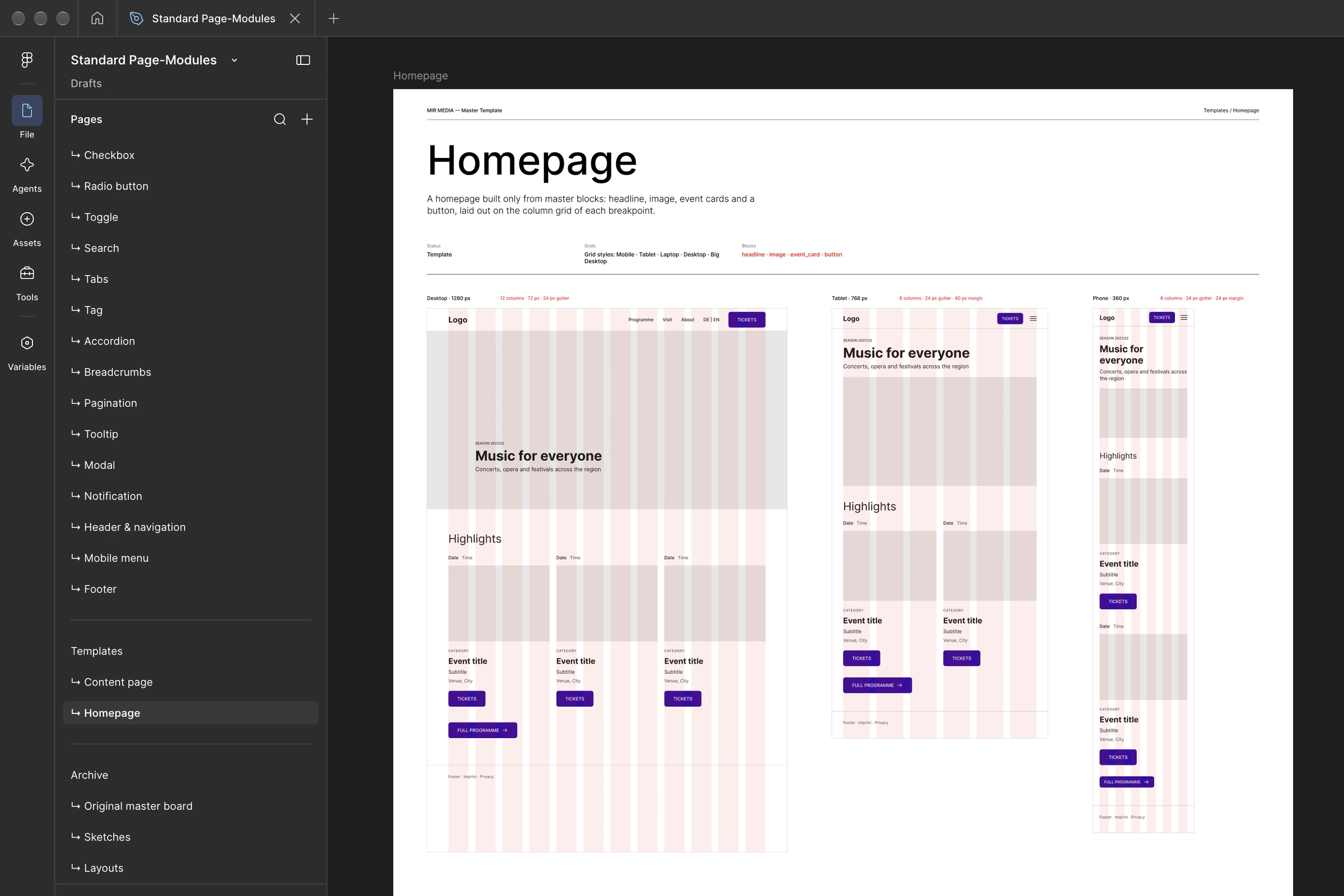
Standard Page Modules in Figma and on real client sites. Left, the homepage template on the desktop, tablet and phone grids. Right, the season highlights module and the same block on Elbphilharmonie, the Vienna Philharmonic and Oper Leipzig: a title, filters and a row of cards, each with an image, a date and a title. Only the identity changes.
Two months instead of six
The first real test was the Lausitz Festival in 2021: one festival in many venues across Lusatia. With the modules, the website was ready in two months instead of the usual six.
That saved time and money, and left room for what only this client needed, like a map of all the festival’s venues in the region.
The homepage, built from Standard Page Modules in the festival’s identity.
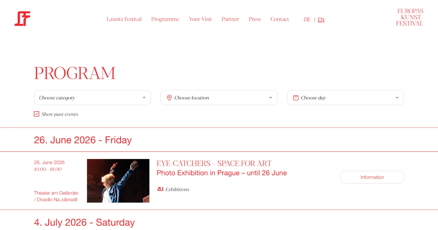
The programme with its filters, and the homepage on a phone.
One language with developers
Because the components in Figma had the same names and options as the blocks in the CMS, designers and developers finally spoke the same language.
At first my boss worried that a template would kill our creativity. The opposite happened: the basics took less time, so we had more time for custom features and interesting problems.
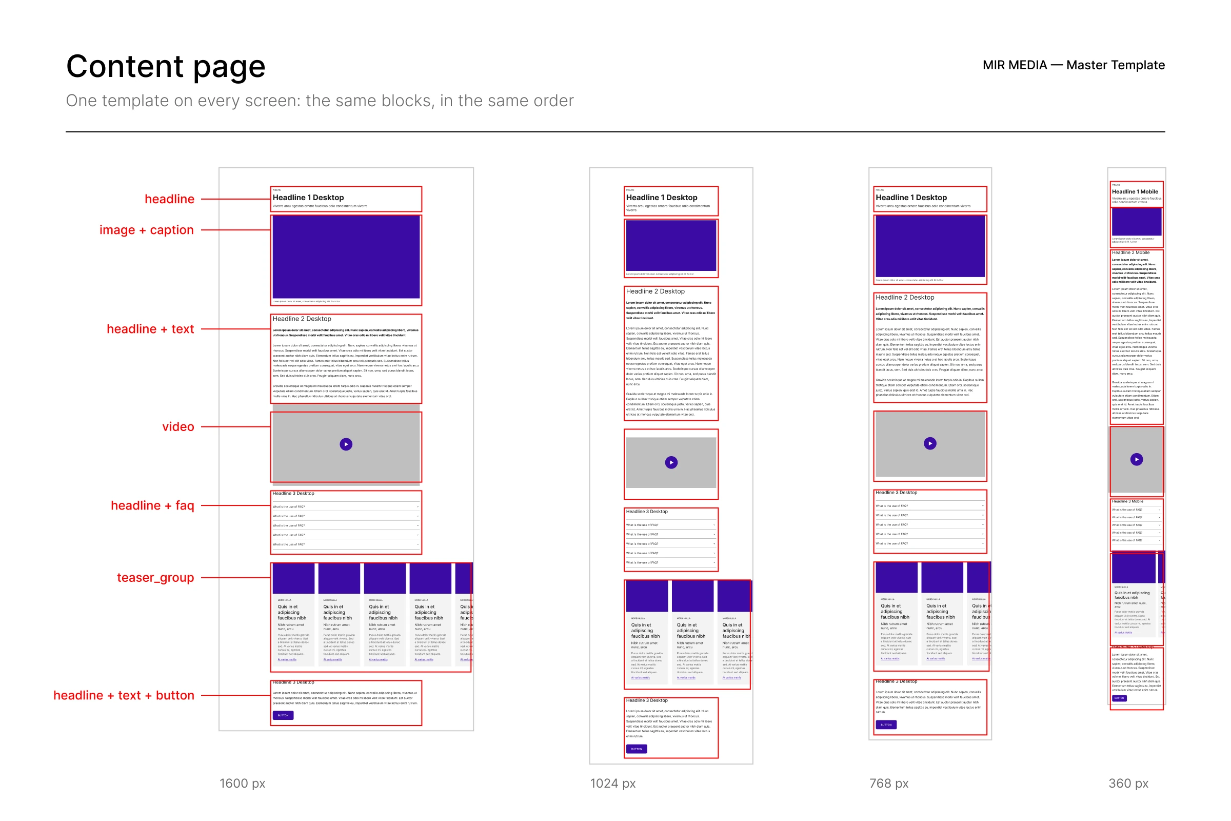
Left, the CMS, recreated: editors add blocks right on the page. Right, the content page in Standard Page Modules on four screen sizes, its blocks named just like in the CMS.
Selected client work
MIR.de: My boss as a client
The agency’s own website is a special kind of project: the client sits a few desks away and has an opinion on every pixel. Two designers had tried to redesign mir.de before me. I was the third, and the one who got it done.
The site is built around the work: big project tiles, each showing the client’s website in its own colour, and case study pages that show the projects in use. Erick, a front-end developer from Brazil who joined later, brought the site to life with animations. mir.de got the agency its first Awwwards.
The homepage, and one of the case study pages, Oper Leipzig, top to bottom.
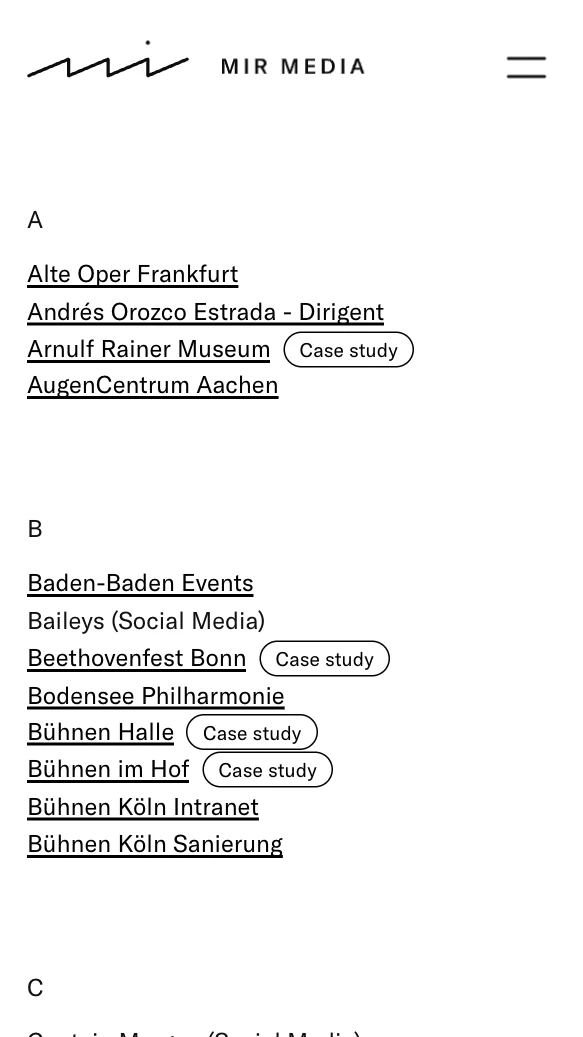
Details: the client list and the menu on a phone, and the pointer and the button reacting to each other.
Elbphilharmonie: A website for everyone
For its 2020 relaunch, the Elbphilharmonie asked us to update its website to match a new corporate identity. Its motto is “a house for everyone”: classical concerts are the core, but there are hundreds of smaller events and workshops, and many visitors only want to see the building and the Plaza, with its beautiful view of Hamburg’s harbour. The website had to work for all of them.
We updated the personas and user flows, and usability tests confirmed what the analytics suggested: the navigation was too complicated. So we simplified it and gave the calendar the two filters people kept asking for: available tickets only, and events in the Elbphilharmonie building only.
The relaunch: big photography, big type, the house first.
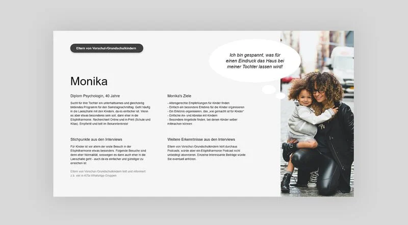
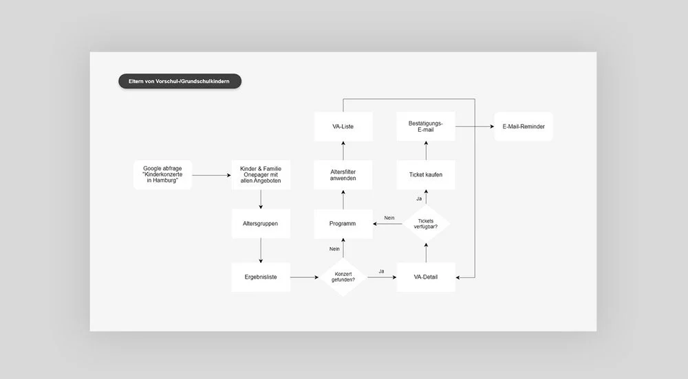
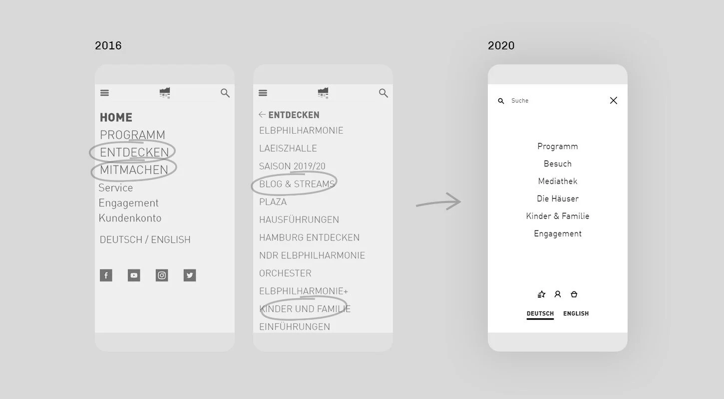
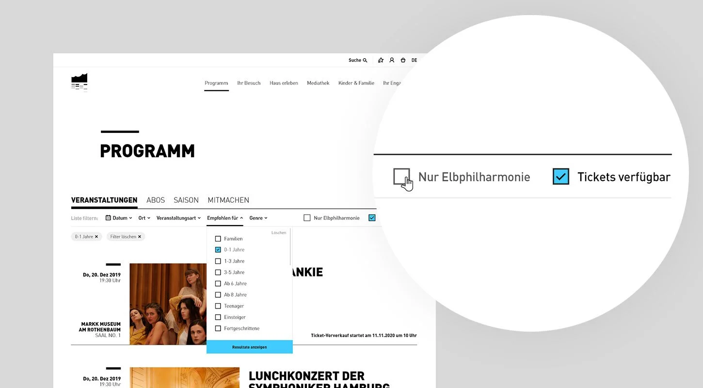
Personas, user flows, the old and the new navigation, and a research finding.
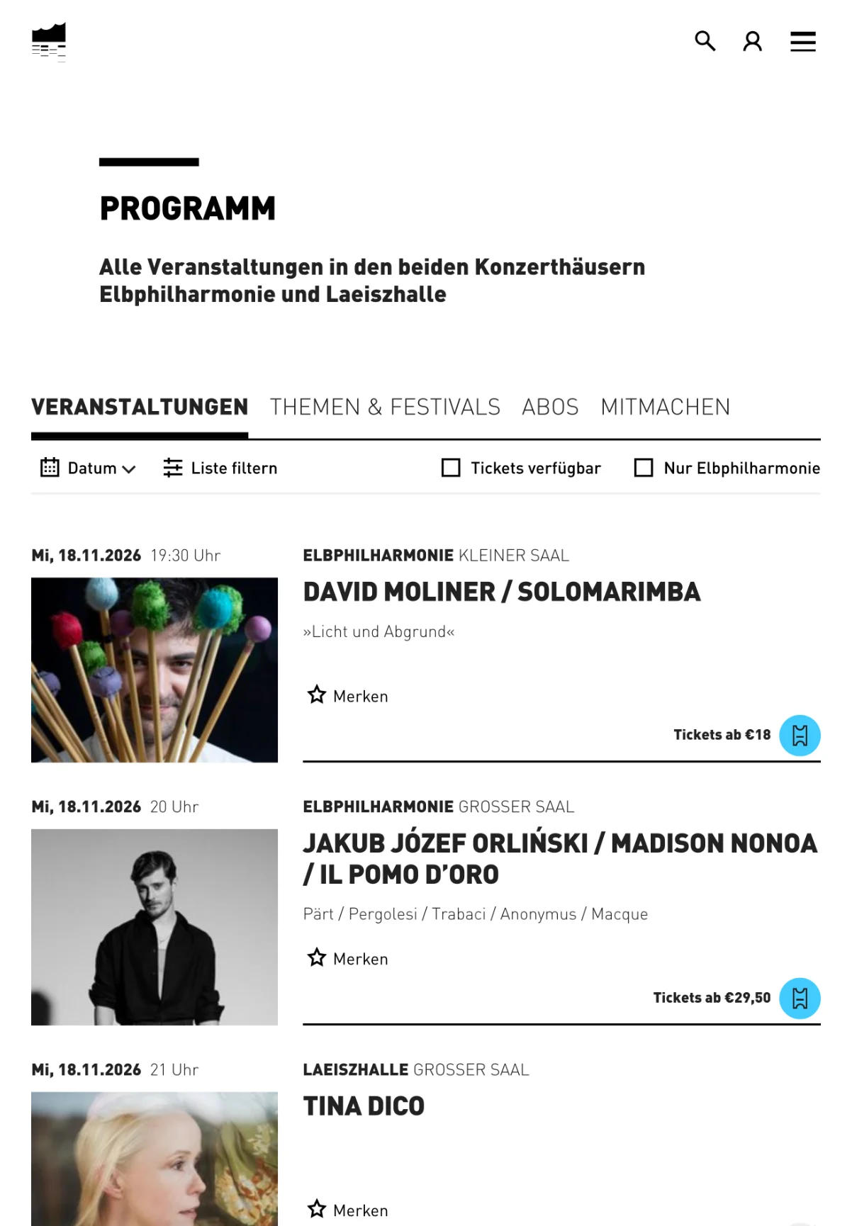
Every screen size: the homepage on desktop, the programme on a tablet, the homepage and the calendar filters on a phone.
Wiener Philharmoniker: Tradition, made accessible
The Vienna Philharmonic, founded in 1842, was the most traditional client I worked with. Its identity is beautiful, with decorative serif type in gold and beige, but on a website it wouldn’t be accessible without changes. In the pitch I proposed something simpler and lighter that still respects the tradition, and we won.
Then we talked to real users: subscribers, ticket hunters, academy students and the ticket office staff. One finding changed the brief: most people who visit the website will never get a ticket. Most concerts go to subscribers, and a subscription can take around twelve years to get. Tickets for a few events do go on open sale, but only rarely.
So we didn’t build the website only around buying tickets. We put the orchestra’s articles and its shop up front, so every visitor has something to read or buy. The dedicated ticket hunters get better filters, and they can sign up for an email when tickets for a concert become available.
The homepage at launch: the orchestra itself, airy and light.
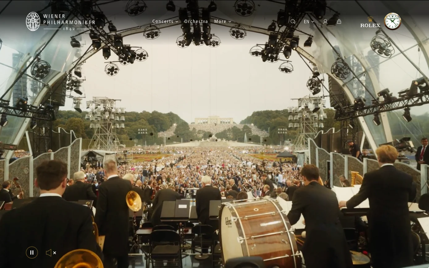
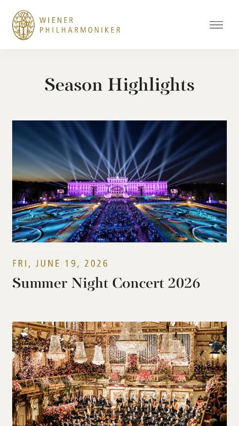
Today: a full-screen film of the Summer Night Concert, and the season highlights on a phone.
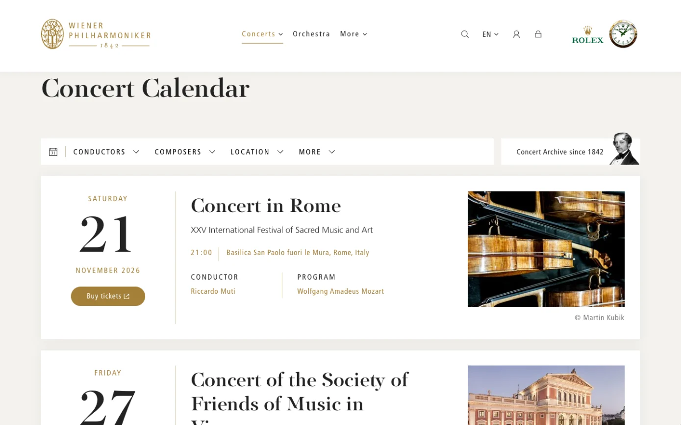
The concert calendar, with filters for the ticket hunters.
Looking back
MIR MEDIA was my first job in Germany. It was also my first web-only agency. I worked with specialists and front-end developers every day, and I became a much better UX designer.
The best part was the people: so many nice, smart people working in culture. Every year I watch the Vienna Philharmonic’s New Year’s Concert, and it reminds me of the great trips to Vienna we took.
I also learned what I don’t want. Agency work comes in waves: late nights before a pitch, then quiet weeks. And we kept building similar sites from scratch. The part I liked most was finding patterns and reusing them. Every site needed the same link to a ticketing system, and that felt like a product waiting to happen. So I moved to product companies, for the steady rhythm and for building things systematically.