Museumdienst Hamburg
Museumdienst coordinates the guided tours’ offer of 30 museums in Hamburg. They needed a tool that would help to choose and book the tours. Within a small team and a short time, we developed a functional yet pretty playful solution.
Role: Designer
With and for: MIR MEDIA
Status: Pitch presentation
Year: 2019
The Pitch
No agency likes to take part in pitches. With its obvious disadvantages, it’s still an opportunity to get interesting clients. Nevertheless, occupying the creative resources of the agency I work for was possible for a limited amount of time. Within a small team of two, me as the designer and our UX researcher, it took us only five days to develop a compelling pitch presentation. Regardless of tight timing, work went quite well and we had a lot of fun during the whole process. We were working simultaneously, exchanging and discussing the ideas quickly and inspiring each other.
Research
There was no time for proper research. Moreover, the briefing from the client was far from well prepared. Therefore, they agreed on the debriefing phone call and based on that, we developed a few proto-personas and defined crucial functions of the product. We also had a bit of luck and accidentally came upon an employee of a similar institution from Cologne. We quickly arranged an interview and added some findings to our picture of the potential users of the product. In the end, we analysed the existing catalogue of offers, which gave us lots of hints about the content of the website.
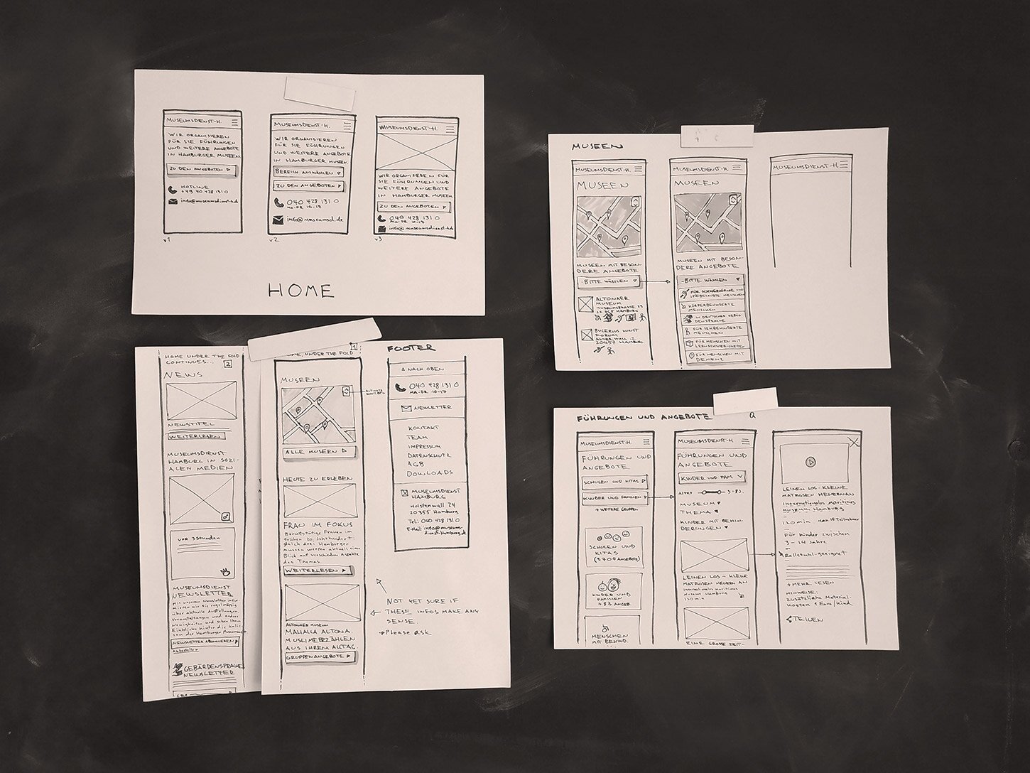
Low-fidelity wireframes were easy to reshape – thanks to that we were able to define crucial functions of the product very quickly.
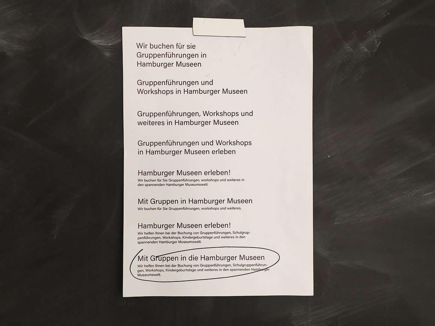
In the previous version of the catalogue, an explanation of what Museumdienst Hamburg is, was somehow hidden and hard to find. We prepared a few versions of the introduction text, tested it internally and chose the most meaningful version.
Key decisions: Critical CTA and.. telephone number in the viewport
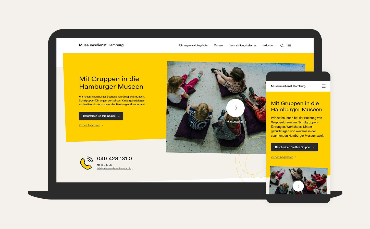
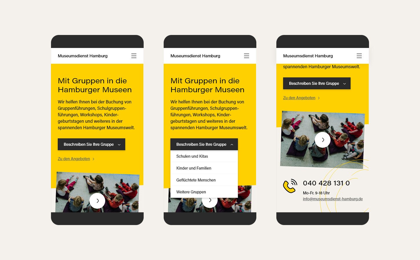
Our primary user is a teacher, but a significant number of users are also parents, retired adults and representatives of institutions like senior clubs. First of all, every group requires an accessible and well organised catalogue of offers. That’s why we decided to give the user access to it straight from the viewport of the homepage. Additionally, they can select their group and enter the catalogue with relevant filters exposed.
In the previous version of the catalogue, there was a piece of critical information missing. However odd it sounds an explanation of what Museumdienst Hamburg is, was somehow hidden and hard to find. We decided to fix it and put a brief intro text upfront in the viewport of the homepage. My colleague (whos German is significantly better than mine) prepared a few versions of the text. We tested them internally by conducting a little corridor-testing-sessions in the agency and chose the most meaningful version.
The last, probably most surprising finding for me was that so many people would prefer to call the institution rather than use the catalogue. No matter how well structured it is. That’s why we decided to place the telephone number and email address in the viewport of the homepage.
Key decisions: The catalogue
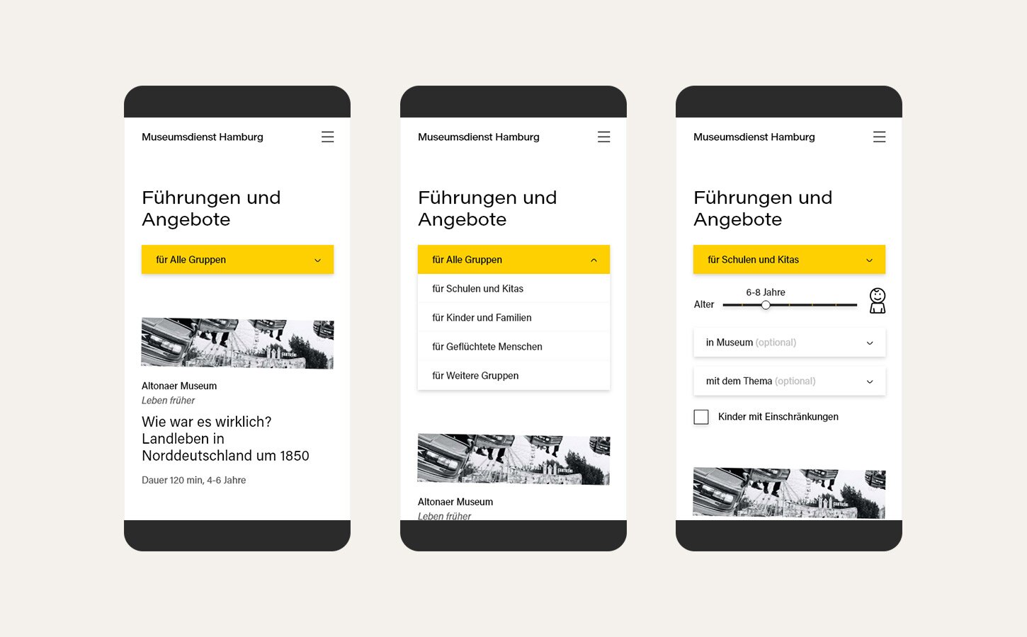
The catalogue, which is a core element of the whole project let the user explore hundreds of guided tours, workshops and other offers for a variety of age groups. We wanted to make it simple and legible. To avoid showing too many input fields, we developed a progressive system of filtering. At first, users will have to select the specific group and only then the rest of the relevant filters will be exposed. As dropdown is well known for not being the best solution we tried not to use it when it’s not necessary. For example, we proposed using a toggle as a tool to choose the age group.
UI Design: Visual language with a twist
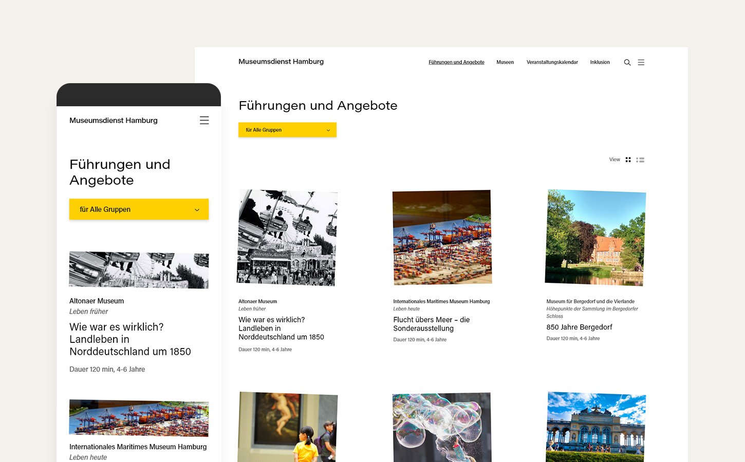
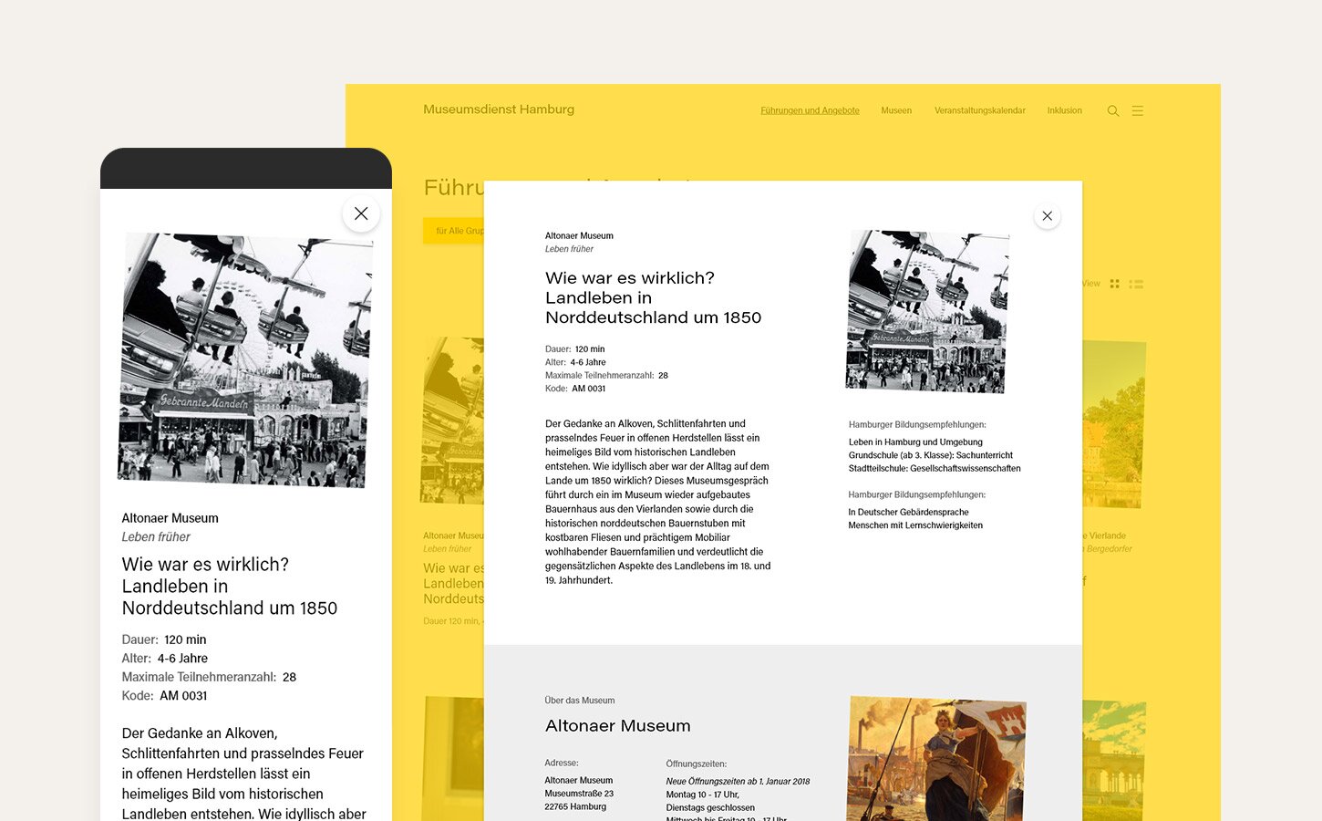
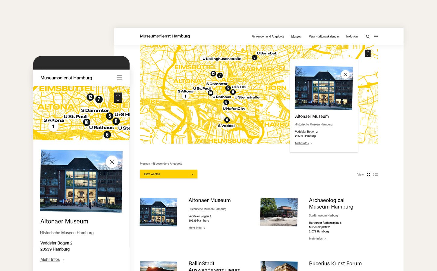
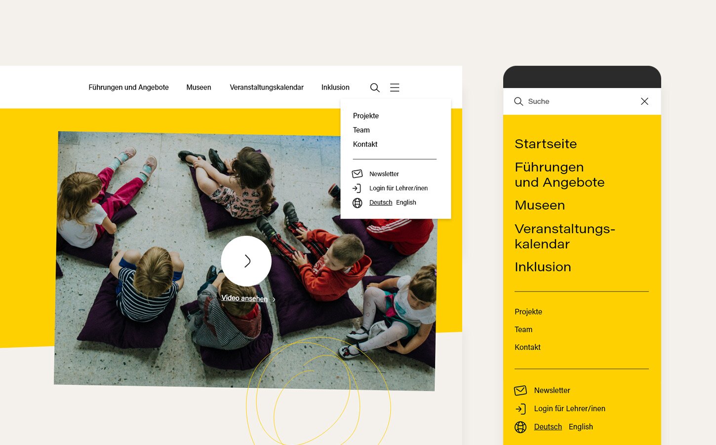
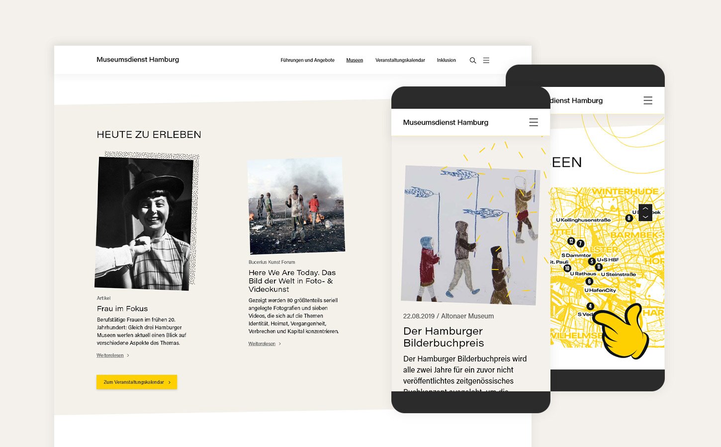
The visual language of the layouts was my responsibility. I try to keep all my designs simple. Nevertheless, if there’s a room for that, I love to add a little extra. Even though the majority of users are serious adults, they often work with kids, so I decided to keep the layout a little playful and funny. Bright yellow, curved photos and scattered patterns give the project a unique look and a lot of character. Despite this slightly unusual feeling, the project is based on a proper grid, uses good quality typography and remains legible. I have to admit that I was pretty happy with the overall look of the layouts.
Summary
It’s time to say that my agency didn’t win the pitch. Nonetheless, I still find the project valuable. I believe that we developed a strong concept and covered most of the user’s needs – with a fresh look and feel into the bargain.